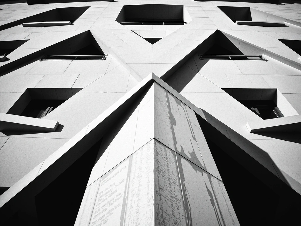
"The city is our primary mood board. Its brutalist architecture teaches us about structure and honesty."
The Geometry of Bogotá Light
Our story doesn't begin with a pitch deck. It begins with the way afternoon light hits the glass towers along Calle 93B. We studied those sharp, geometric shadows—the honest interplay of structure and environment—and asked: why does most web design hide the structure?
This observation became our core principle: Digital Brutalism. It’s not about raw aesthetics; it’s about the honest use of technology. We strip away decorative noise to reveal the underlying system. Our first client, a local coffee roaster, needed a site that felt as honest as their single-origin beans. No stock photos. Just typography, texture, and the raw truth of their craft.
"We don't design for screens; we design for the space between the user's thumb and the glass."— Lead Designer, pixlixa
Every project rests on our 12-column system, mapped directly to the urban planning of the Chapinero district. It’s not just a layout—it’s a constraint framework that ensures rhythm and clarity before a single pixel of color is applied.
The 5-Stage Build vs. The Pretty Trap
The Immersion
We don't send forms; we map the business physics. Micro-scenario: We trace the exact 30-second path a customer takes before hitting "buy"—every friction point, every hesitation.
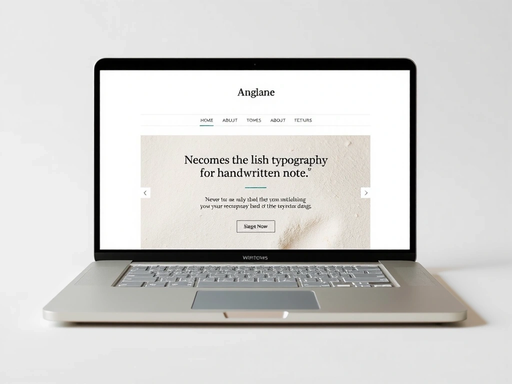
The Black & White Frame
No colors, no fonts. Just the "93B Grid." This is where we prove the concept works. Pitfall Averted: We avoid the "Pretty Homepage Trap"—building logic before visuals.
The Material Layer
Typography and color treated as physical materials. Constraint: We refuse to use more than two typefaces per project. Clarity demands discipline.
The Stress Test
We break it on old phones, slow connections. Finding the breaking point is our Digital Durability promise.
The Handover
You get a "Living Document"—a visual map of the site’s architecture. No account managers. Just the architect.
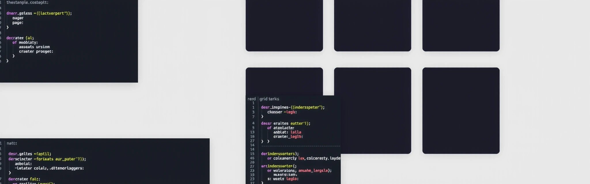
Proof is in the Pattern
We don't believe in "before and after" hero shots. We believe in showing the work—specifically, the constraints we navigated and the trade-offs we made. Here are three artifacts from recent builds.
The Studio Glossary
- Digital Brutalism
- The honest use of code without decorative sheen. If the HTML structure fails, the design fails.
- Speed vs. Soul
- Our trade-off: We accept slower build times to ensure a unique digital fingerprint. No templates.
- The 3-Second Rule
- Performance metric. If it loads in >3s on 3G, we strip it. No exceptions.
The Feature Bloat Pitfall: We recently refused to build a custom booking widget for a gym, linking to their existing reliable system instead. Result: Faster site, zero maintenance cost, seamless UX.
"They built a site that feels as honest as our beans. No fluff."
"Direct line to the engineer. No gatekeepers."
The Custom Code Premium: Trade-offs
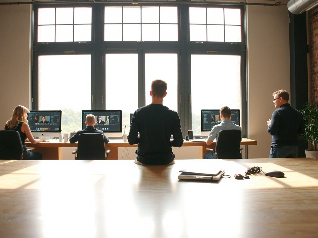
The 4 PM Review
Every pixel is questioned by the whole team. No exceptions.
Two windows. One desk. A wall of books.
We work from Calle 93B #13-44. Look for the concrete facade with the large, unadorned windows. Inside, you'll find the team defined by obsession, not titles:
- • The Architect: Wires the grid. Refuses color until the bones are unbreakable.
- • The Scribe: Writes the copy. Believes a website's voice is 50% of the UX.
- • The Engineer: Stress tests everything. If it breaks, she makes it stronger.
The Contact Protocol
We don't do sales pitches. The first call is a "Discovery Session"—a deep dive into your business physics. You talk directly to the people who will build your site. No gatekeepers.
Ready to map your business physics?
Send us a note. We reply within 24 hours, usually with questions, not a pitch deck.