Fintech Dashboard
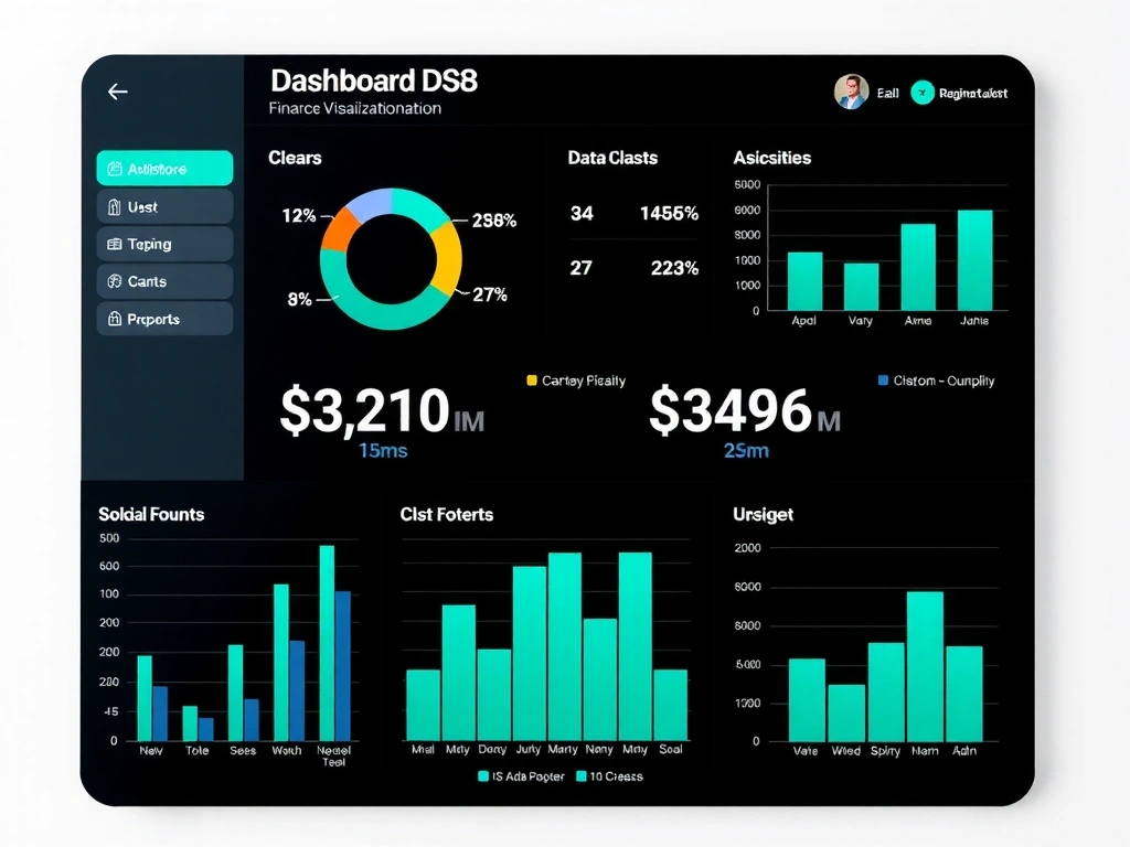
Emerald Ledger Interface
Rebuilt a legacy trading platform's UI for clarity under pressure. Constraint: 4-week timeline. Trade-off: Custom SVG icons over icon font library.

"Our portfolio isn't a gallery of finished screens—it's a field notebook of decisions made under constraint." Bogotá, Colombia
Every project in this portfolio solves a real constraint: a limited timeline, a complex legacy system, or a budget that demanded surgical precision over wholesale reinvention.
This page displays a curated selection of recent work from our Bogotá studio. You won't find generic mockups or placeholder copy. Instead, you'll see the actual trade-offs we navigated—why a horizontal scroll matrix was chosen over a modal, or why a dark breaker was necessary to reset the user's attention.
Who this is for: Product managers and founders who need to understand our visual grammar and decision-making process before the first call.
Rebuilt a legacy trading platform's UI for clarity under pressure. Constraint: 4-week timeline. Trade-off: Custom SVG icons over icon font library.

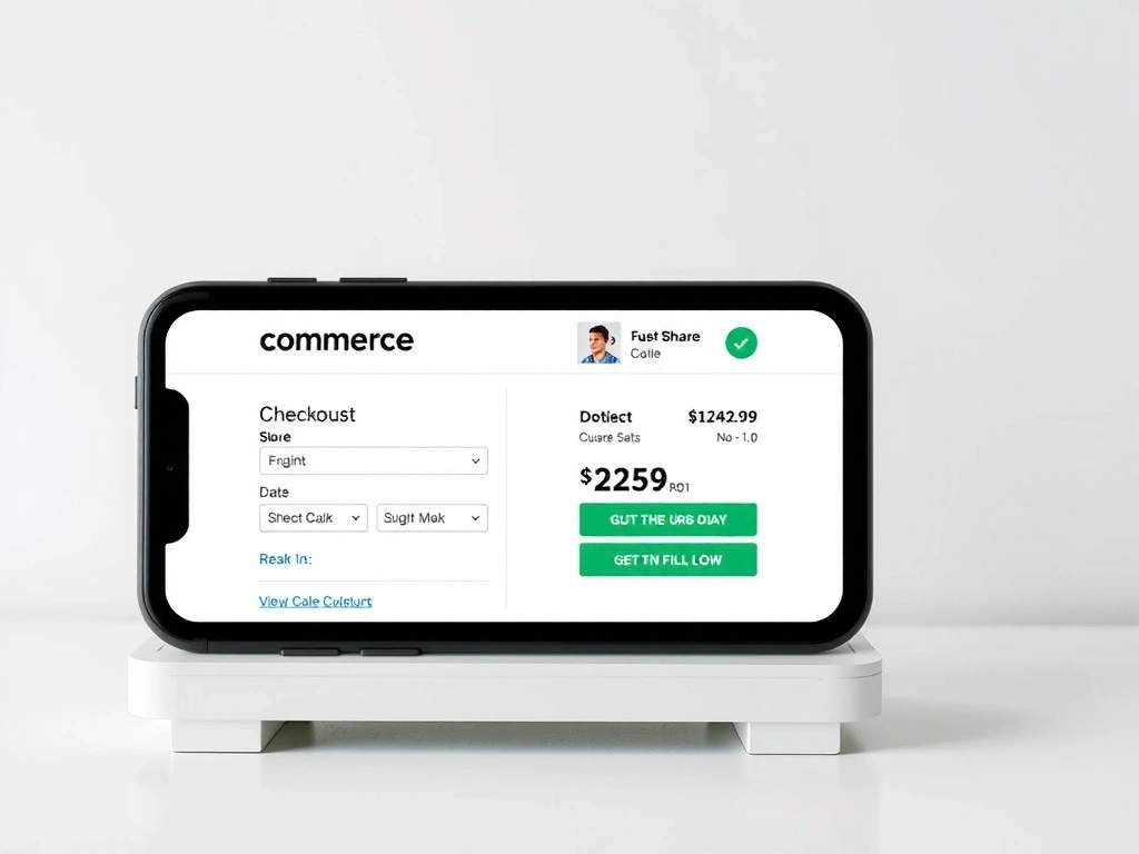
Bogotá artisan marketplace. Mobile-first checkout.
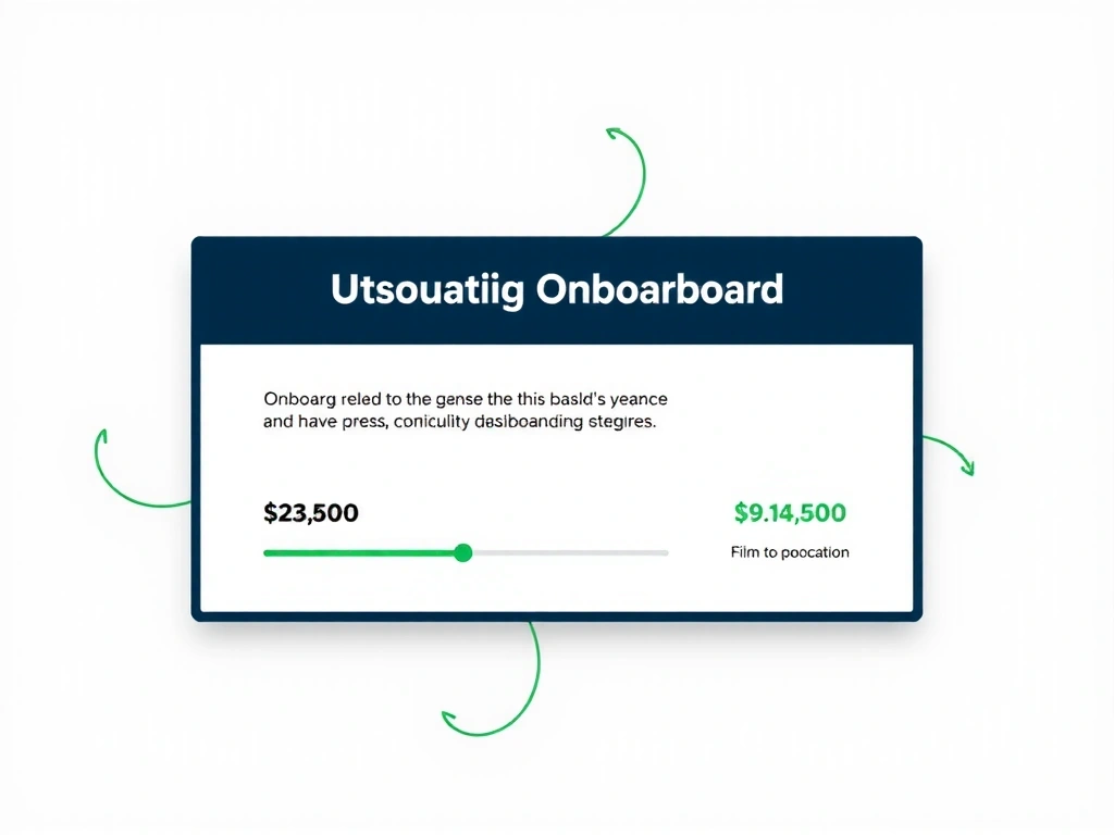
Visual system for Calle 93B practice. Grid-first design.
Reduced drop-off by simplifying the visual path. Constraint: No backend changes allowed. Solution: Pure CSS state indicators.
We optimize for clarity under constraint. Here's how that shapes our work.
Modular components over bespoke animations.
Vanilla JS over heavy frameworks when possible.
Strong grid systems over experimental layouts.
We won't use experimental CSS features without fallbacks.
Scope is locked early. We protect timelines aggressively.
If it doesn't serve the user, it doesn't ship.
In our Bogotá studio, we start with a simple rule: every pixel must justify its existence. This isn't minimalism for its own sake—it's a discipline born from working with lean teams and tight budgets. When a client comes to us with a three-week deadline and a complex product, we can't afford to waste time on decorative flourishes.
The projects you see here share a common thread: constraint-driven creativity. The fintech dashboard didn't need more data—it needed better visual hierarchy. The local e-commerce site didn't need more features—it needed a checkout flow that felt trustworthy on a shaky 3G connection in Chapinero.
"The best design decision we made was removing three features, not adding one."
We use a 4:3 aspect ratio for our hero panels because it forces focus. We apply neon dots only to indicate active states or critical paths—never for decoration. This restraint creates space for the work to breathe, and for you to see the quality that matters.
Visual Note: The emerald accent (#10B981) you see throughout this page isn't just a brand color. It's our internal shorthand for "decision point"—a moment where the user must choose, and we need to guide them without shouting.
"Can we launch Monday?" It happened with a local e-commerce client. Timeline pressure meant cutting the wishlist feature. Outcome: Focused on checkout speed instead. Conversion rate improved 12% in first week.
Over-designing for mobile. We see agencies build complex gestures for touch devices that 80% of users won't discover. Our fix: static, clear tap targets with immediate feedback.
Limited Budget: Client wanted a "unique" identity. We used a single geometric shape as a motif across the site, rotating it 90° for different sections. Cost: $0. Impact: Recognizable.
PHP
Tailwind
Vanilla JS
MySQL
"We don't sell websites. We sell the feeling that a user knows exactly where to tap next, even on a crowded bus."
— pixlixa Founder
We review portfolio fit, timeline, and budget alignment before the first call. If we can't help you, we'll tell you why.